
culture happens when we're together
These guidelines define the identity, voice, and production constraints for VIVA PHX. Use them as the framing for all assets developed in relation to the festival. If something is missing or ambiguous, request it through the contact process below.
How To Use
This is the single reference for the VIVA PHX 2026 visual and verbal identity. All assets are downloadable inline and in the footer. Scripts for automation and asset generation are noted where available. Treat these guidelines as framing for any assets developed in relation to the festival.
Brand Context
VIVA PHX frames culture as more than content delivered to an audience — it's a relational system produced through shared time, movement, and proximity. The festival is not a single stage or a single event. It's a network: artists, venues, and audiences forming a temporary circuit across Downtown Phoenix. For six days, the city becomes programmable.
Boilerplate (Short)
VIVA PHX is an annual cultural festival built on gathering in Downtown Phoenix, to create and celebrate culture, music, food, art, and spend time together.
Logo System
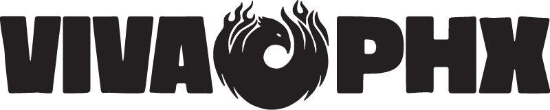
Two primary marks are supplied: the logo lockup (wordmark + logomark) and the logomark (phoenix mark alone). Do not extract or use the wordmark by itself.
Primary Lockup Primary


Reduced-contrast treatment; use where the mark should recede or not compete with content


Logomark Primary


Reduced-contrast treatment; use where the mark should recede or not compete with content


2024 Logo Lockup Sanctioned


Reduced-contrast treatment; use where the mark should recede or not compete with content


Co-Branding
VIVA PHX logo always appears at top or left of any co-branded layout; sponsor marks follow. Presenting sponsors may appear in proximity to the primary mark but never at equal or greater size. Sponsor logos must be reproduced in their own approved colorways — do not recolor sponsor marks to match the VIVA PHX palette. Co-branded materials must maintain clear space rules around the primary mark. No sponsor logo may be placed within the clear space zone.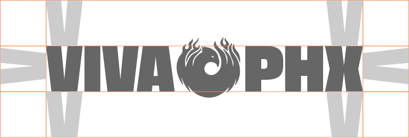
Typography
TT Neoris — TT Neoris Variable · Variable · Internal only
Licensed to Eros Works for internal production of VIVA PHX assets and web use. Cannot be redistributed to partners or vendors.
All typographic hierarchy is expressed through size and a single variable axis: weight. The system uses flush alignment, tight spacing, and size as the primary organizational tool. Decoration comes from scale and weight relationships, not stylistic variation or additional typefaces.
Type Scale
Display 1
Display 2
Display 3
Heading 1
Heading 2
Heading 3
Body Large
Body
Label
Caption
The scale is built on a 12pt baseline unit. Each step is defined by multiplying by factors of 2 and 3 only, producing sizes of 12, 24, 48, 96, 192, 384 as the typographic spine, with intermediate steps at 18, 36, 72, and 144. Every size sits on the baseline grid and any two sizes relate by a simple whole-number ratio.
Weight and tracking tighten as size increases. Leading should be tight and aligned to a 12pt baseline. Tracking: −12 in Illustrator / −.1rem in CSS for display text; 12 in Illustrator / 0rem in CSS for body and metadata text.
For outlined type in SVG or AI format, send copy requests to the brand contact.
Grid System
Standard 12-Column
- Context
- web
- Columns
- 12
- Gutter
- 12px
- Margin
- 12px
- Baseline
- 12px
Default grid for all screen, print, and general layout use. Common subdivisions: halves (6), thirds (4), quarters (3), sixths (2). For mobile web, collapse to 1, 2, 3, or 4 columns via media queries.
Extended 24-Column
- Context
- Columns
- 24
- Gutter
- 12px
- Margin
- 12px
- Baseline
- 12px
For complex poster layouts, multi-tier lineups, dense editorial grids. A subdivision of the 12-column grid (1 standard column = 2 extended units). Use when you need half-column offsets or asymmetric placements the 12-column grid cannot accommodate.
Script · v1.0.0
VIVA PHX 2026 Grid Builder
This script, when run in Adobe Illustrator, will build a grid aligned with the specs provided in this brand hub on either the current artboard, or all artboards.
Script · v1.0.0
VIVA PHX 2026 Type Scale Builder
This script, when run in adobe Illustrator, will generate text elements with every type size for the VIVA PHX 2026 brand, provided TT Neoris is installed on your system.
Color
The palette is organized around a contrast system that works across light and dark modes. Each accent color has a tonal-pair grey with an identical luminance index, enabling ultra-low-contrast layering without visual interference.
Palette
Offwhite
--color-offwhite
RGB 230 231 232
Light Grey
--color-light-grey
RGB 205 205 205
Orange
--color-orange
RGB 245 138 79
Maroon
--color-maroon
RGB 102 3 51
Black
--color-black
RGB 36 31 33
Maroon Grey
--color-maroon-grey
RGB 39 39 39
Orange Grey
--color-orange-grey
RGB 164 164 164
Mid Grey
--color-mid-grey
RGB 102 102 102
Maroon Grey is the black-and-white tonal equivalent of Maroon. Orange Grey is the black-and-white tonal equivalent of Orange. Mid Grey is the mathematical average of the two.
This system prevents background motifs from interfering with strong typographic elements: the grey variant and its paired color share the same tonal index, so a voronoi pattern rendered in Maroon Grey on a Maroon background produces texture without competing for visual attention. Light Grey on Offwhite and Maroon Grey on Black produce similarly ultra-low-contrast relationships.
Light Mode Tokens
| Token | Color |
|---|---|
--bg-accent | Orange |
--motif-on-dark | Maroon Grey |
--text-tertiary | Mid Grey |
--text-on-accent | Orange |
--bg-primary | Offwhite |
--text-primary | Black |
--bg-secondary | Light Grey |
--motif-default | Light Grey |
--bg-accent-muted | Maroon |
--text-secondary | Maroon Grey |
Dark Mode Tokens
| Token | Color |
|---|---|
--bg-accent-muted | Maroon |
--motif-on-dark | Light Grey |
--text-primary | Offwhite |
--text-tertiary | Orange Grey |
--border-strong | Light Grey |
--text-secondary | Light Grey |
--bg-secondary | Maroon Grey |
--border-default | Maroon Grey |
--bg-accent | Orange |
--text-on-accent | Orange |
--bg-primary | Black |
--motif-default | Maroon Grey |
Photography & Art Direction
Photographs can be used in one of two ways in the VIVA PHX brand;
Full Spread Imagery
Images can be used as backdrops, with text and outlined voronoi motifs overlaid atop. Ensure that the type color choice meets minimum contrast requirements and doesn't clash directly with the imagery. This implementation requires careful finesse.
Images in the Grid
Images can also be used in a more traditional grid-based layout, spanning several columns or a single column. This is often the preferred choice for editorial and type-heavy layouts, especially those with long body text.
Photographs can be found here. Please credit all photography from this folder to Isaac Torres.
Motifs
Voronoi Pattern System
Code-generated SVG voronoi pattern used as the primary graphic motif across all applications. Patterns are produced by a parametric tool and can be configured per-colorway.
Usage Context
Background texture, section dividers, environmental graphics. Use the tonal-pair grey variant when overlaying on a colored background to prevent the motif from competing with typographic elements.


Motif colors follow the semantic token system: --motif-default and --motif-on-dark. Grey variants match the tonal index of their color counterparts, producing ultra-low-contrast texture that does not interfere with content.
Tools & Scripts
Voronoi Mortar Generator v1.21.0 · generator
A generator for the VIVA PHX 2026 motif; something like mortar, mycelial fluid, spongy matrix inside of a bone -- the interstitial tissue which connects us, a web of material.
Voice & Messaging
Tone
Approved
Center Phoenix as the subject of sentences wherever possible
VIVA PHX uplifts the endemic culture of Phoenix. The linguistic choice reflects the attitude that VIVA is about developing, incubating and connecting what Phoenix has to offer. It's about Phoenix.
Use: 'Downtown Phoenix becomes programmable for six days.' Avoid: 'VIVA PHX takes over Downtown Phoenix.'
Use connection-oriented terms: connection, culture, communication, sharing, relation, cooperation
VIVA PHX is about bringing people together. Language should foreground connectivity.
Use: 'Artists and audiences forming a temporary circuit across Downtown Phoenix.' Avoid: 'Attendees consuming performances across the city.'
When in doubt, fall back on: 'culture happens when we're together'
Core messaging anchor. Keeps all communications aligned with the festival's thesis.
Prohibited
Avoid colonial language: 'takes over', 'conquers', 'invades', 'dominates'
Contradicts the festival's relational, community-centered positioning.
Do not frame VIVA PHX as solely a music festival
VIVA PHX covers many kinds of cultural production, connection and conversation — music, art, food, and gathering.
Avoid terms emphasizing a consumptive relationship to VIVA PHX
Foreground connectivity and participation over consumption.
Avoid: 'experience VIVA PHX', 'consume culture' Prefer: 'participate in', 'gather for', 'connect through'
Naming Conventions
Brand name capitalization
Always write the name as VIVA PHX in all caps.
Full name usage
Use the full name VIVA PHX wherever possible. Occasional use of VIVA alone is acceptable for brevity in long text bodies, but never in headlines or header text. The project is about PHX — PHX should appear in the name wherever possible.
Arts events
VIVA PHX arts events are called DEEP TIES at {location}. Use all caps.
DEEP TIES at There Space Studios DEEP TIES at Roosevelt Row
Boilerplate Copy
Boilerplate (Short)
VIVA PHX is an annual cultural festival built on gathering in Downtown Phoenix, to create and celebrate culture, music, food, art, and spend time together.
Brand Context
VIVA PHX frames culture as more than content delivered to an audience — it's a relational system produced through shared time, movement, and proximity. The festival is not a single stage or a single event. It's a network: artists, venues, and audiences forming a temporary circuit across Downtown Phoenix. For six days, the city becomes programmable.
Why Support VIVA PHX?
VIVA PHX connects local culture with national attention. Independent artists, established acts, scenes, audiences, and partners converge across a curated set of venues. The result is density, discovery, and measurable cultural impact.
Why Multi-Venue and Multi-Day?
Culture doesn't happen in isolation. It builds in clusters, scenes, and neighborhoods — over time, together. The multi-venue model preserves local identity while increasing exposure. It allows audiences to discover new artists organically and allows artists to plug into a broader ecosystem without losing their specific context.
Assets & Downloads
All files follow the naming pattern: {brand}_{asset}_{variant}_{colorway}.{ext} — kebab-case for non-semantic separation (replacing spaces), underscores for semantic separation.
Complete Brand Kit
↓ Download ZIP — Full Brand KitLogos
2024 Logo Lockup
Logomark
Primary Lockup
Graphic Motifs
Voronoi Pattern System
Tools & Scripts